What Creative Direction Actually Means for a Personal Brand
Brands hire creative directors to protect a point of view. Solo creators rarely do — and end up remaking the same decisions every week. Here's what the role actually involves, and how to hold it yourself.
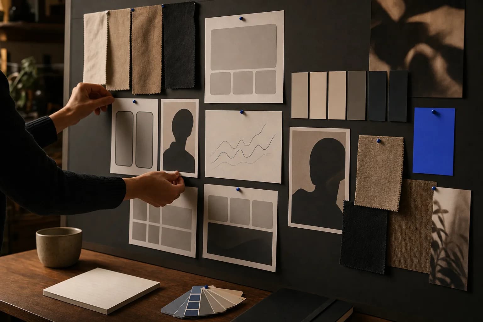
In an agency or a consumer brand, creative direction is a job with a desk, a budget and veto power. Someone decides what the work looks like, sounds like and feels like, then defends that decision against a hundred small pressures to dilute it. The role exists because taste, left undocumented, dissolves the moment more than one person starts making things.
Most creators inherit that job without the title. You are the strategist, the producer, the on-camera talent and the person deciding at 11pm whether the thumbnail is good enough to publish. Creative direction gets squeezed into whatever attention is left, which is usually none — so it defaults to instinct, and instinct drifts. Six months later the feed looks like four different people made it, and nobody can say precisely what changed.
The useful move is not to hire someone. It's to understand what the function actually does, strip out the parts that only make sense inside a large organization, and keep the parts that compound for an individual. That's the translation this piece is aiming for.
Creative Direction Is a Decision System, Not a Mood
The common misreading is that creative direction means having good taste. Taste is the input. The output is a set of decisions made once, written down, and reused — so that future work inherits them instead of relitigating them. A creative director's real product is speed and consistency under pressure.
Think about the decisions you currently make fresh every single time you publish. What the title treatment looks like. Whether this one gets a face in the thumbnail. How long the intro runs before the substance starts. Which of your three slightly different colour schemes applies. Each is small. Collectively they're a tax on every piece of work you ship, and they're the reason publishing feels heavier than it should.
A direction system converts those into standing answers. Not rules for their own sake — answers that free you to spend your judgment on the thing that actually varies, which is the idea. A creator with clear direction can look at a rough cut and know within seconds whether it's on-brand, because the criteria exist outside their mood that day.
- Format decisions: what your recurring content shapes are, and how each opens and closes
- Visual decisions: type, colour, framing, crop logic, the amount of negative space you tolerate
- Verbal decisions: how you title things, what words you never use, how you handle humour
- Quality floor: the minimum standard below which something gets fixed or shelved, not published
- Exception rules: when you're allowed to break the above, and who decides (you, but deliberately)
Visual Identity for One Person Is Recognition, Not Branding
Corporate visual identity is built for scale and control: a logo lockup, clearance rules, a Pantone library, a hundred-page guideline document policing all of it. Almost none of that infrastructure helps a creator, and chasing it is how people end up spending three weeks on a logo nobody will ever look at closely.
What a personal brand needs from visual identity is narrower and harder: instant recognition in a hostile environment. Your work appears beside a dozen competing pieces in a scrolling feed, at thumbnail size, often with your name cropped out. The question is whether someone who follows you can identify your post before they read a word of it. That's the only test that matters.
Recognition usually comes from fewer elements than people expect, held more rigidly than people are comfortable with. One dominant colour that isn't the platform's default palette. One type family, used at two or three deliberate sizes. A consistent relationship between you and the frame — always centred, always off to one side, always in the same kind of room. A creator who films in the same corner of the same space with the same lighting setup builds more visual equity than one who chases a new backdrop every month, even if each individual backdrop is prettier.
The trap on the other side is rigidity that reads as sterile. Personal brands survive on the sense that a human is present, and humans are inconsistent in small charming ways. So hold the structural elements tight — colour, type, framing, pacing — and let the texture stay loose. The handwriting on the whiteboard behind you, the way you actually talk, the outtake you left in. Direction should constrain the container, not the person inside it.
Content Production Quality Is About the Floor, Not the Ceiling
Creators tend to think about content production quality as a ceiling problem: better camera, better editor, more elaborate graphics. That framing produces expensive, fragile output. You make one beautiful thing, it takes four weeks, the momentum dies, and the next piece is a phone video that looks nothing like it. Audiences read that gap as unreliability, even if they couldn't articulate why.
A creative director thinks about the floor instead. What is the worst version of this that we would still be happy to publish, and can we hit it every single time under realistic conditions? That's a fundamentally different question, and it produces a different set of investments. Better audio and consistent lighting raise the floor permanently for very little ongoing effort. A twelve-hour motion graphics sequence raises the ceiling once and then makes everything after it look worse by comparison.
Defining the floor also settles arguments with yourself. If your standard is that every talking-head piece needs clean audio, a stable frame, captions and a hook in the first sentence, then a piece missing captions isn't a judgment call — it's unfinished. That clarity is what makes delegation possible later. You cannot brief an editor on "make it feel like me." You can brief them on a floor.
- Raise the floor first: audio clarity, consistent lighting, legible captions, clean framing
- Standardise anything repeated: intros, lower thirds, end cards, thumbnail composition
- Reserve high-effort production for a small number of anchor pieces, clearly signposted as such
- Write the floor down as a checklist, not a feeling — it should be pass/fail
- Re-audit it every quarter; floors creep upward as your skills and tools improve
The Brief You Write for Yourself
Inside an organization, creative direction travels through briefs. Someone writes down the objective, the audience, the constraints and the non-negotiables, and the work gets judged against that document rather than against whoever's opinion is loudest in the room. Creators skip this step because it feels absurd to brief yourself. It isn't. The brief is how today's clear-headed version of you instructs next Tuesday's exhausted version.
A creator brief can be a single page and still change how the work lands. The essential parts: who this is for and what they already believe, what shift you want in their head by the end, the one idea it can't lose, and the things this piece is explicitly not trying to do. That last line does more work than the rest combined, because most creator content fails from trying to serve three audiences and two goals at once.
Briefs also give you something to review against, which is where direction turns into craft. Instead of watching your own edit and feeling vaguely dissatisfied, you ask: does this deliver the shift? Is the one idea still intact after cutting? Did the opening earn attention or assume it? A creator who runs that review honestly on twenty pieces will improve faster than one who publishes two hundred on instinct, because they're generating feedback about their choices rather than just their output.
This is also the artifact that makes collaborators useful. An editor, designer or ghostwriter working from a brief plus a floor checklist produces something recognisably yours on the first attempt. Working from vibes, they produce something generic, you rewrite it, and you conclude that delegation doesn't work for you. The bottleneck was never their talent — it was undocumented direction.
Holding the Line When the Numbers Argue With You
The hardest part of creative direction isn't defining a point of view. It's keeping one while performance data pulls in every direction. A piece that breaks your format does unusually well. A trend format is clearly working for everyone in your category. A brand partner asks for something that sits awkwardly with how you normally sound. Each is a small, reasonable invitation to abandon the system — and the system only produces value if it survives them.
The workable posture is neither purity nor drift. Treat outlier performance as a hypothesis, not a mandate. If an off-format piece outperforms, the question isn't "should I abandon my format?" but "which specific element did the work, and can it live inside my direction?" Often the winning ingredient is a sharper hook or a more concrete promise — both of which you can absorb permanently. The unsustainable version is copying the surface of the thing and finding that your audience stops recognising you.
It helps to separate the layers explicitly. Distribution tactics should change often, because platforms change often. Format and packaging can be tested deliberately, one variable at a time, with enough runway to read the result. Core identity — your point of view, your voice, the visual signature people recognise — should change rarely and on purpose, not because a single post underperformed on a Tuesday. When creators tell us their brand feels muddled, it's usually because those three layers have collapsed into one, and every tactical result gets treated as an identity crisis.
There's also a commercial argument for holding the line. Sponsors, clients and collaborators pay for legibility. A creator whose work is instantly identifiable is easier to pitch internally, easier to build a campaign around, and harder to substitute. Consistency isn't just an aesthetic preference; it's what makes a personal brand into an asset that someone else can value.
Where This Leaves You
Creative direction for creators comes down to three things a large brand pays a department to handle: decisions made once and written down, a quality floor you can hit reliably, and the discipline to distinguish tactical experiments from identity changes. None of it requires a bigger budget. It requires being willing to commit to answers and then live inside them long enough for the compounding to happen.
Start with whatever you currently redecide every week, and settle it. One colour, one type choice, one framing rule, one checklist that tells you when a piece is finished. The reward isn't only a tidier feed — it's the reclaimed attention that comes from no longer negotiating with yourself over details that were never the point.</p>
Frequently asked questions
A creative director defines and protects how work looks, sounds and feels, then makes sure every piece produced fits that definition. In practice the job is mostly decision-making and quality control rather than hands-on design. For a solo creator, the same function means writing down your standing choices so you're not remaking them on every post.
Usually not. Recognition for a personal brand comes mainly from consistent colour, type, framing and pacing — the things visible at thumbnail size in a crowded feed. A wordmark or simple monogram can be useful later for merchandise or partnerships, but it rarely drives recognition on its own.
Hold the structural elements tight and let the texture vary. Keeping the same colour, type, framing and format while changing the ideas, settings and energy reads as reliable rather than repetitive. Audiences tend to notice sameness in topic and pacing long before they notice sameness in visual treatment.
Strategy decides what you make, for whom and why — the topics, formats and goals. Creative direction decides how the finished work looks, sounds and feels, and sets the standard it has to meet. They're separate jobs that constantly inform each other, and confusing the two is why some creators have a clear plan but inconsistent output.
Focus on raising the floor rather than the ceiling. Clean audio, consistent lighting, a stable frame and legible captions do more for perceived quality than expensive equipment or elaborate graphics. Standardising anything you repeat — intros, end cards, thumbnail layouts — also removes effort permanently rather than once.
Change it when your positioning, audience or the substance of your work has genuinely shifted, not because a single post underperformed. Deliberate, infrequent refreshes let you keep accumulated recognition while updating what no longer fits. Frequent changes reset that recognition and make the brand harder for partners to understand.
Ready to put this into practice?
Tell us what you’re building and where you want to grow — we’ll help you turn it into a system.
Related reading
How to Adapt Your Tone for Each Social Media Platform Without Losing Your Voice
Sounding native on LinkedIn, TikTok and Instagram doesn't mean becoming four different people. Here's how to separate the part of your voice that should never move from the parts that should flex by platform.
The Role of Sound and Music in Shaping a Brand's Creative Direction
Most personal brands document their colours, fonts and tone of voice — then leave audio to whatever the editor found in a stock library that morning. Here's how to treat sound as a deliberate part of your creative direction.